Password Protected
Design System

Crafting a Scalable & Unified Framework

Enterprise UX

ADA Accessibility

Design Consistency

B2B SaaS

UI Component Library

Scalable Framework

Cross-Platform

UX Strategy

Team Collaboration

Stakeholder Engagement

We developed a scalable design system to ensure visual consistency and streamline workflows across products. By standardizing components and creating clear design guidelines, we improved collaboration between designers and developers. Engaging stakeholders throughout the process allowed us to build a flexible framework that supports future growth and aligns with the organization’s strategic goals.

Role

  • UX Team Manager
  • UI Development Manager
  • Designer
  • Researcher

Team

  • 6 UI Developers
  • 4 UX Designers
  • 3 PM Consultants

Tools

  • Figma
  • Illustrator
  • VS Code
  • Storybook

Timeline

  • 120 Days
  • Sept. 2022
    (v1.0)

The Cost of Inconsistent Design

By unifying UI components and processes, the design system eliminated inefficiencies, reduced redundancies, and empowered teams to create cohesive, user-centered products. Without a standardized framework, teams struggled with inconsistency, wasted effort, and prolonged development cycles.

Before its implementation, fragmented UI components led to usability gaps, inefficient collaboration forced designers and developers to rebuild elements from scratch, and the absence of standardized assets slowed product releases. By addressing these challenges, the design system became a catalyst for efficiency, consistency, and faster time-to-market.

Discovery

Researching and Identifying Needs

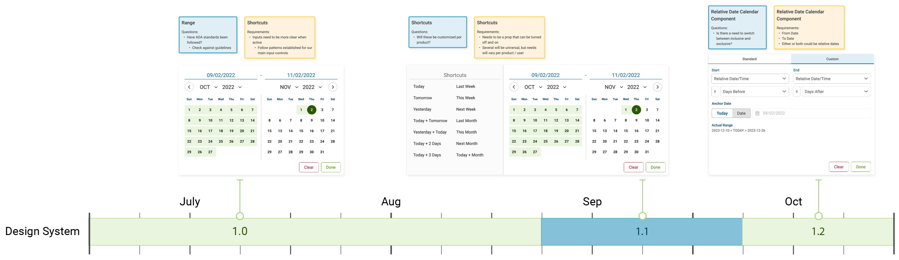
Goal: Understand the gaps, inconsistencies, and needs in our existing UI components.

This

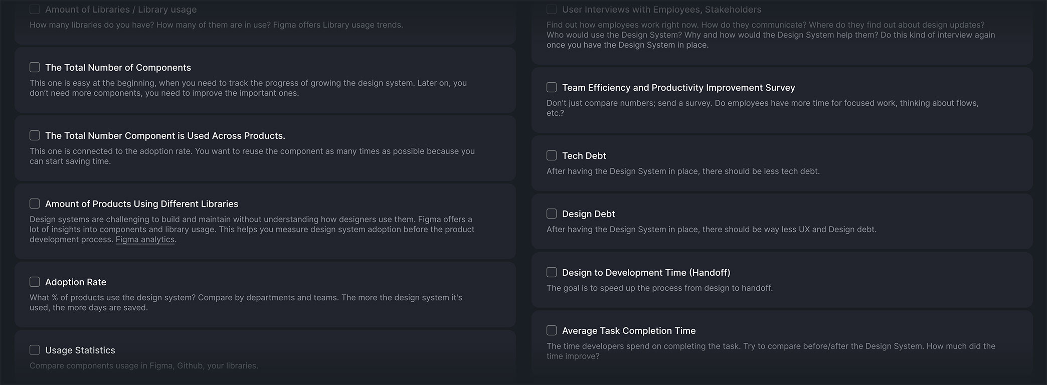
To ensure the design system addressed organizational pain points, we conducted a comprehensive audit of existing UI components across all products and platforms. This involved identifying inconsistencies in design elements like typography, color schemes, and button styles. Alongside the audit, we engaged with stakeholders to uncover challenges in using and maintaining these components, ensuring we captured a wide range of perspectives.

Key Activities

  • Conducted a comprehensive UI audit to assess inconsistencies in design elements.
  • Interviewed designers and developers to gather insights into component reuse challenges.
  • Engaged stakeholders from product management, development, and customer success to understand pain points and priorities.

Outputs

  • Detailed Audit Reports: Documented inconsistencies and usability gaps in the current design systems.
  • List of Components: Prioritized the most critical UI elements requiring standardization.
  • Stakeholder Alignment: Identified cross-team challenges and opportunities for collaboration.
Analysis / Definitions

Establishing a Strong Foundation

Design System Banner

Goal: Define a foundational set of reusable UI components and design principles.

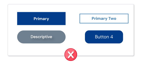
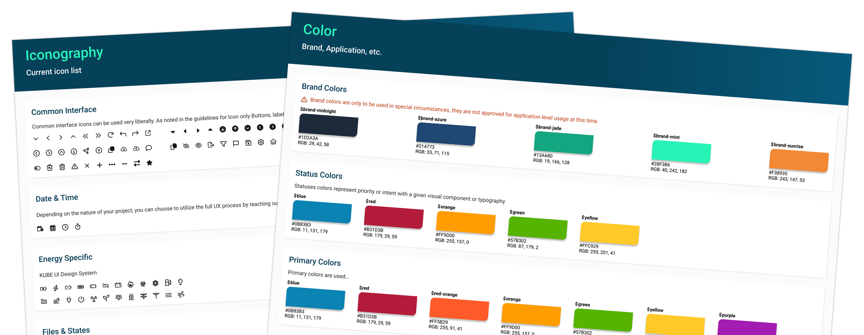
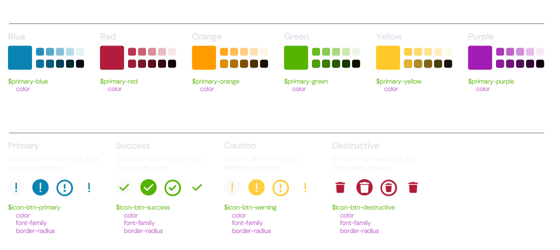
With the audit complete, we defined the core elements that would form the backbone of the design system. These included typography, colors, buttons, form elements, and grid systems. We also established clear design principles to ensure these components could scale effectively across products while maintaining consistency and adaptability.

Key Activities

  • Identified and defined core UI components such as typography, colors, buttons, and icons.
  • Drafted universal design principles to guide consistency and scalability.
  • Created responsive grid and layout systems to support design across devices.

Outputs

  • Core Component Library: Draft of standardized components and usage guidelines.
  • Design Guidelines: Detailed documentation for implementing components consistently.
  • Responsive Layout Systems: Defined grids and layouts for adaptable designs across devices.
Low-Fidelity

Prototyping to Validate Usability and Scalability

3D Design System Graphic

Goal: Validate the usability and consistency of key components across platforms.

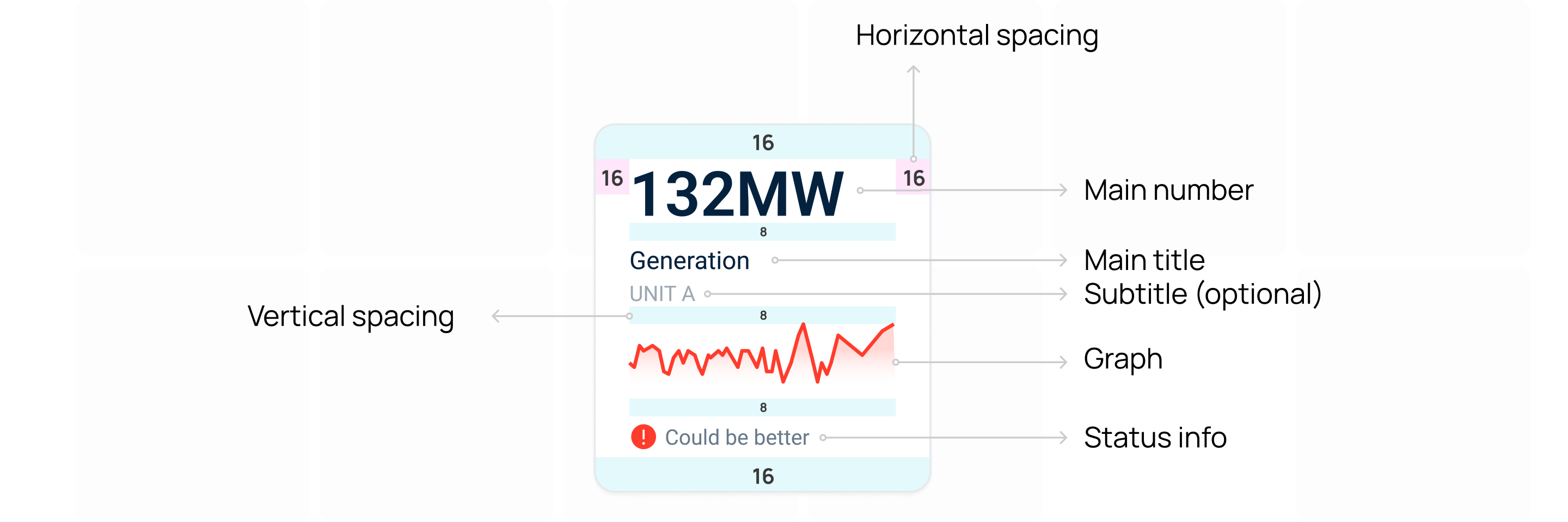
We translated the foundational components into low-fidelity wireframes and prototypes to test their functionality in real-world scenarios. Feedback from designers and developers during this phase ensured that each component could be implemented effectively without compromising usability or scalability.

Key Activities

  • Created low-fidelity prototypes of core components to test functionality and scalability.
  • Conducted usability tests with designers, developers, and product teams.
  • Refined prototypes based on iterative feedback from stakeholders.

Outputs

  • Refined Prototypes: Improved versions of components based on usability testing.
  • Implementation Insights: Identified challenges to utilize components globally.
  • Prioritized Adjustments: Determined refinements, defined grids and layouts for adaptable designs.
High-Fidelity

Designing Polished, Accessible Components

Redlined Component

Goal: Develop high-fidelity components that meet design, usability, and accessibility standards.

Using the validated prototypes, we finalized the design of each component with high-fidelity precision. Accessibility was a key consideration, and every element adhered to WCAG standards to ensure inclusivity. The finalized components were then documented in a centralized platform for easy access by teams.

Key Activities

  • Designed high-fidelity UI components with pixel-perfect precision.
  • Ensured accessibility compliance through adherence to WCAG guidelines.
  • Documented components in Figma which was connected to Storybook: detailed here.

Outputs

  • High-Fidelity Component Library: A polished, accessible, and ready-to-use design system.
  • Accessibility Standards: Verified compliance for universal usability.
  • Centralized Repository: A single source for teams to access components.
Integration and Testing

Seamlessly Merging Design with Development

Coding Library

Goal: Ensure seamless integration of the design system into the codebase for scalability.

We worked closely with developers to build reusable code components based on the high-fidelity designs. Rigorous usability testing ensured that the components functioned effectively across platforms, and detailed documentation made implementation and customization seamless.

Key Activities

  • Collaborated with developers to build reusable code components aligned with design specifications.
  • Conducted validation testing to ensure functionality across platforms and devices.
  • Documented implementation guides for designers and developers.

Outputs

  • Reusable UI Code Components: A library of well-documented, developer-friendly elements.
  • Validated Functionality: Testing confirmed seamless integration into the product ecosystem.
  • Implementation Guides: Detailed instructions for developers and designers to ensure consistent use.
Continuous Feedback / Iterations

Keeping the Design System Dynamic

Timeline

Goal: Continuously refine the design system to align with evolving needs and feedback.

After launch, the design system was continuously monitored to identify gaps or opportunities for improvement. Regular feedback loops with teams ensured the system evolved alongside product needs, maintaining its relevance and scalability.

Key Activities

  • Established feedback channels with product teams, designers, and developers.
  • Monitored the use of components across projects to identify improvements.
  • Iterated on components to meet new product needs and team feedback.

Outputs

  • Iterative Updates: Continuous improvements to ensure scalability and usability.
  • New Components: Additional elements developed to address evolving requirements.
  • Team Adoption: Improved adoption rates across all teams due to ongoing refinements.
Bringing It All Together

A Unified Framework for Collaboration and Efficiency

The design system provided a comprehensive, centralized framework that empowered teams across the organization. By standardizing UI components and processes, we improved collaboration, reduced inconsistencies, and accelerated product delivery. Designers and developers worked more efficiently, ensuring a cohesive user experience across all platforms and products.

With reusable and accessible UI components, the system created a consistent design language that seamlessly integrated across our ecosystem. This standardization not only enhanced usability but also streamlined design and development workflows, reducing inefficiencies and enabling faster time-to-market. By eliminating redundancy and fostering alignment, the design system became a cornerstone of efficiency and scalability.

Impact and Results

Metrics

40%

Reduction in design and development time for new product features.

25%

Improvement in cross-team collaboration efficiency, as reported by designers and developers.

50%

Faster onboarding for new team members due to the centralized and well-documented design system.

Reflection & Takeaways

This project highlighted the transformative value of a well-executed design system in addressing inconsistencies and inefficiencies across teams. By involving stakeholders throughout the process and focusing on scalability, the design system became a cornerstone for delivering cohesive, high-quality user experiences.

The iterative approach ensured that the system not only met immediate needs but also remained adaptable for future growth.